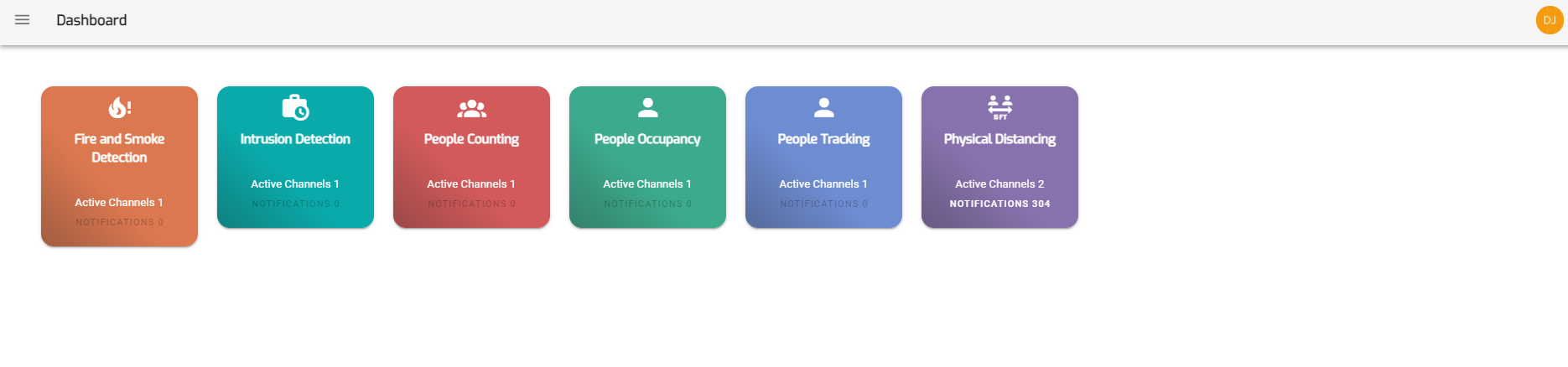
The Dashboard displays different use-case cards like Physical distancing, People tracking, People counting, People Occupancy etc, each in different colors.
Each use-case card displays the use case name, Number of active channels and notifications for that use case.
The user can click on a particular use case card and see streaming for that use case.
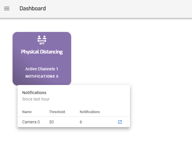
The user can also click on notifications option present on the use case card to see the number of notifications generated for that use case in last 1 hour and visualize it using the blue icon on the right.